Stripe Merchant Dashboard
Sweating the details of Stripe's most-used product
In 2022, I took over leadership of the Stripe Merchant Dashboard team. The merchant dashboard is the center of Stripe's product experience; at that time, more than 1.4 million users relied on the dashboard to run their business. It was a major source of revenue for Stripe, too — the company generated more than $4 billion in revenue from SaaS delivered via theh dashboard.
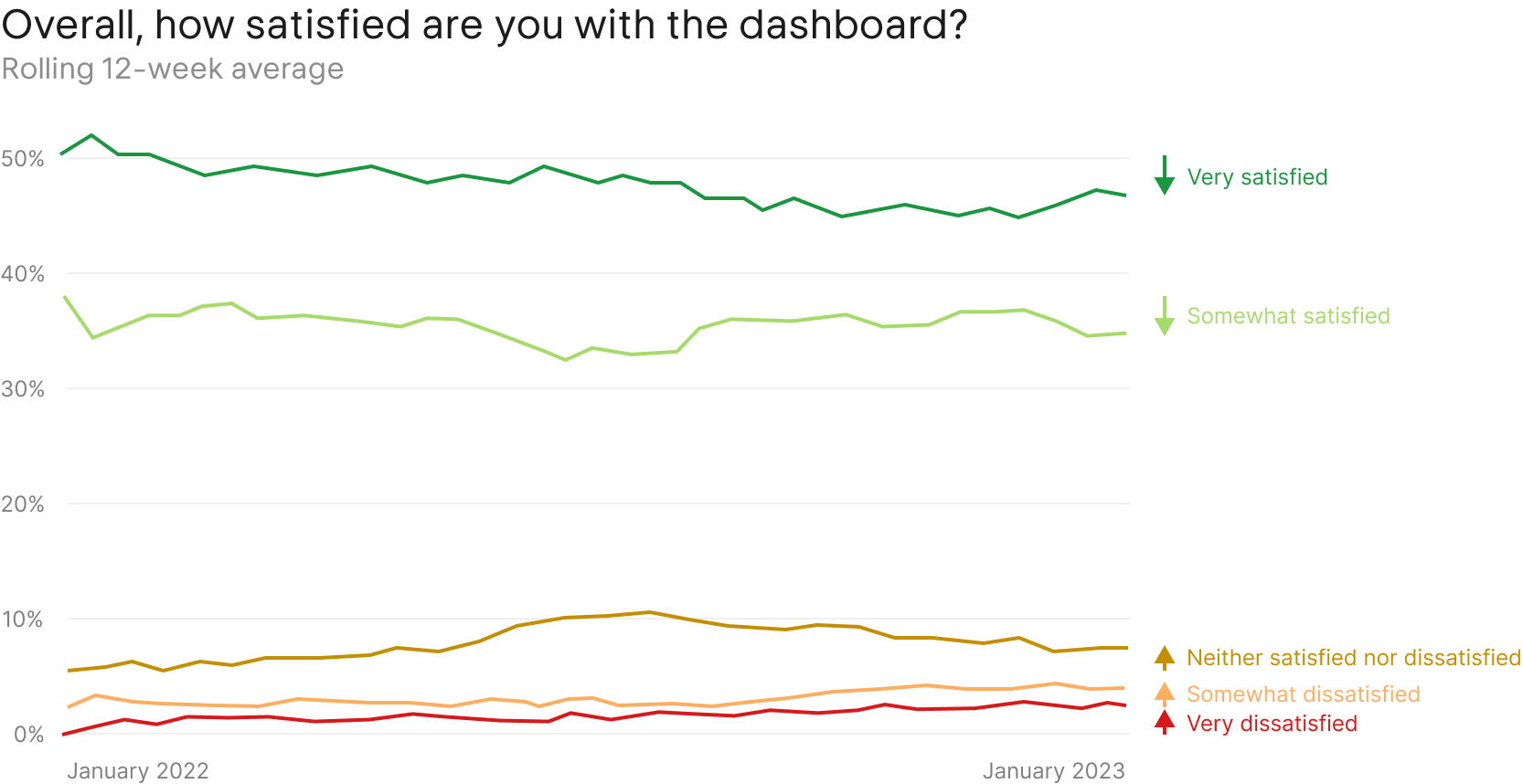
Despite this, the dashboard was starting to show signs of age. User satisfaction was declining, and the decentralized nature of the product meant that many teams were working on their own versions of the dashboard, leading to a fragmented experience. With my leadership, the team set out to unify the dashboard experience, simplify the information architecture, and set up the product for future growth.
Design system
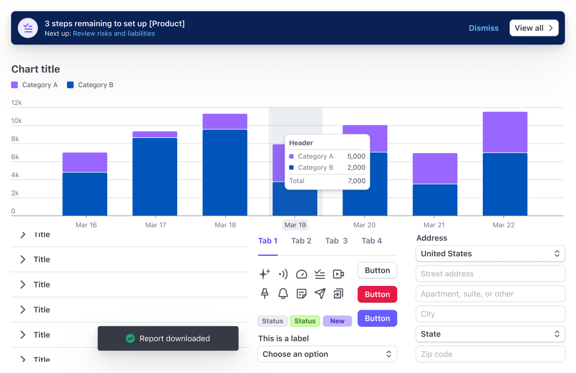
The dashboard was built on a design system that had been in place for several years. Recently, the design systems team had released a new version of the system, but adoption was slow. This meant the dashboard was not responsive, and was missing major accessibility features, and couldn't be themed (ie, no dark mode).
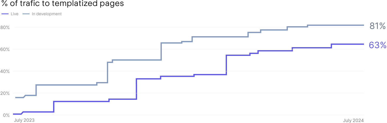
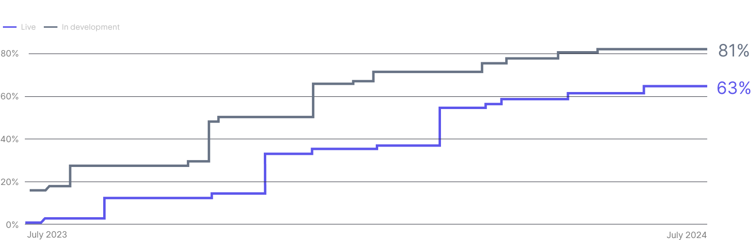
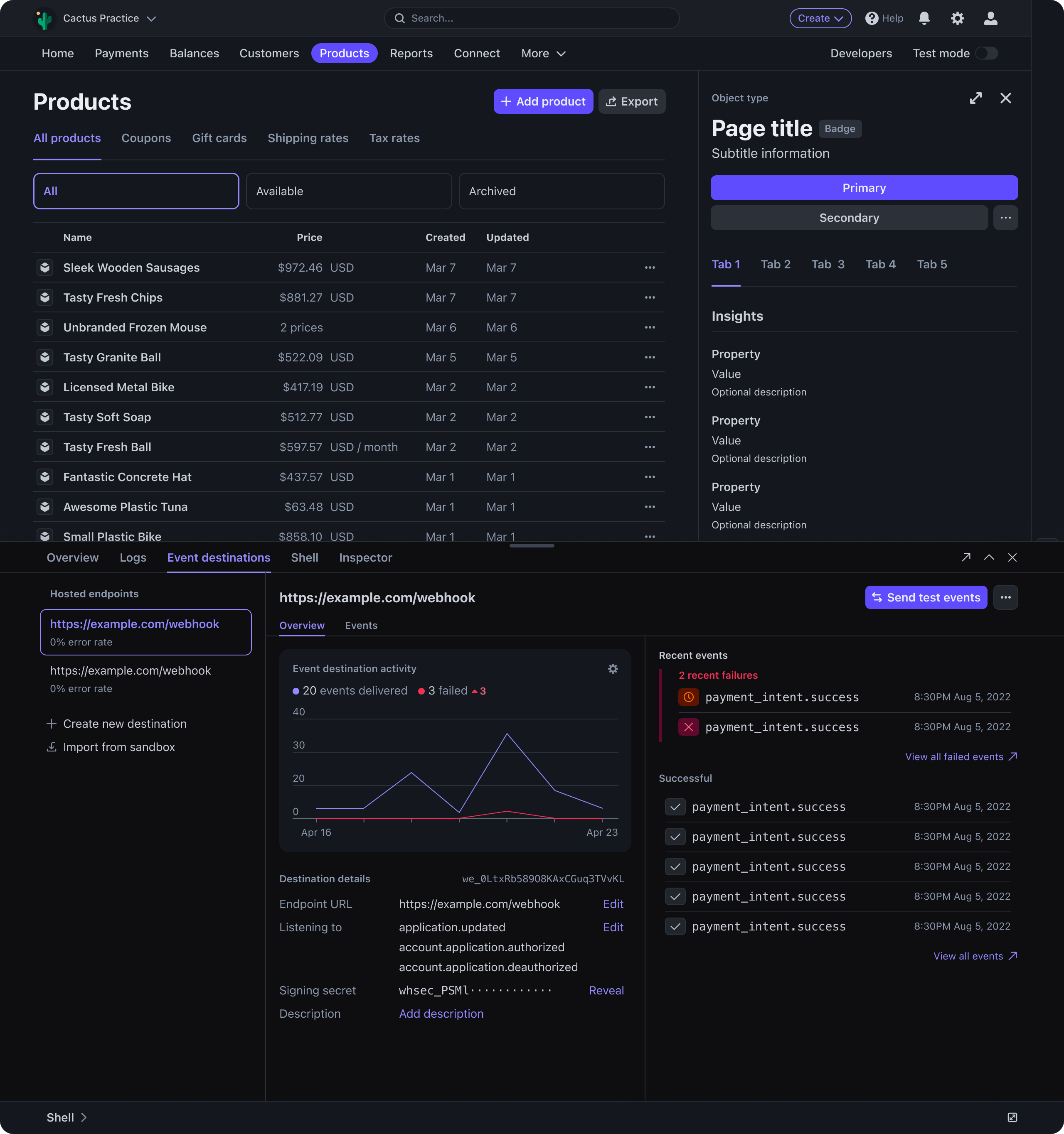
I chartered a plan to migrate 100% of the dashboard's codebase to the latest version of the design system, and managed the effort by coordinating dozens of teams over the course of two years. Tactically, we provided dozens of templates and AI-powered migration pathways that allowed engineering teams to seamlessly migrate their product experiences.
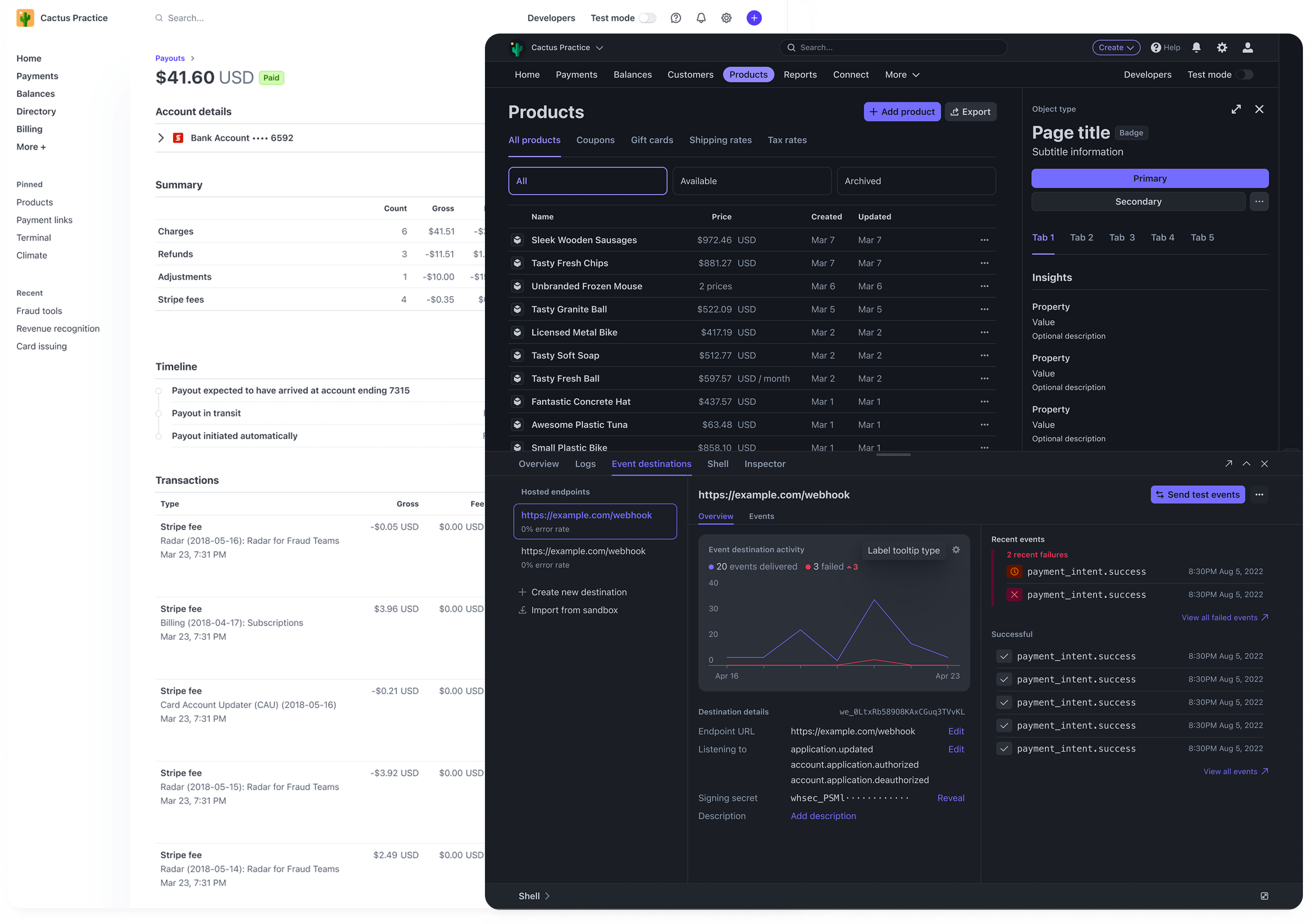
Because we built all of the components to be fully themable, this design system served as a backbone for an external-facing feature called Stripe Embedded Components. Embedded components enabled merchants to seamlessly embed Stripe's dashboard functionality into their own apps, matching it to the look and feel of their product.
Responsiveness
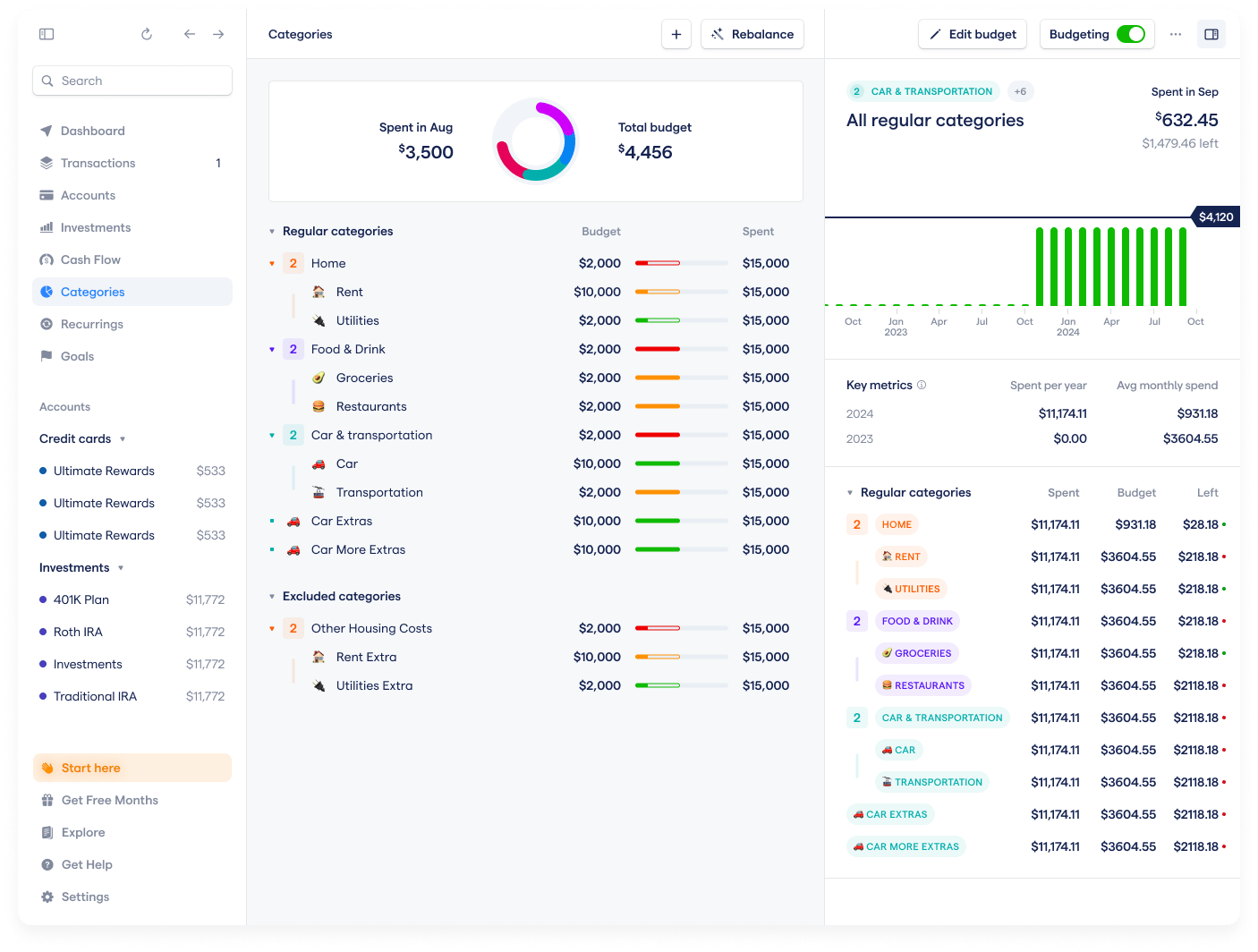
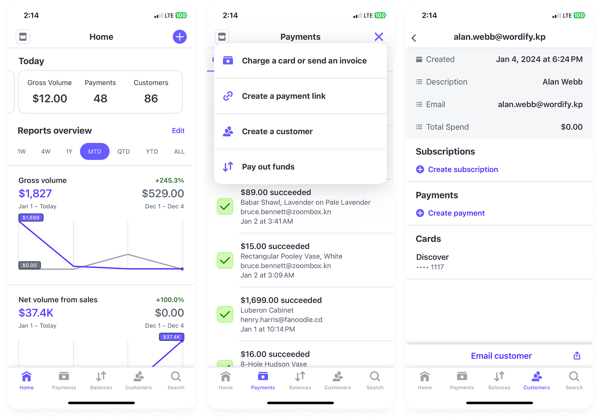
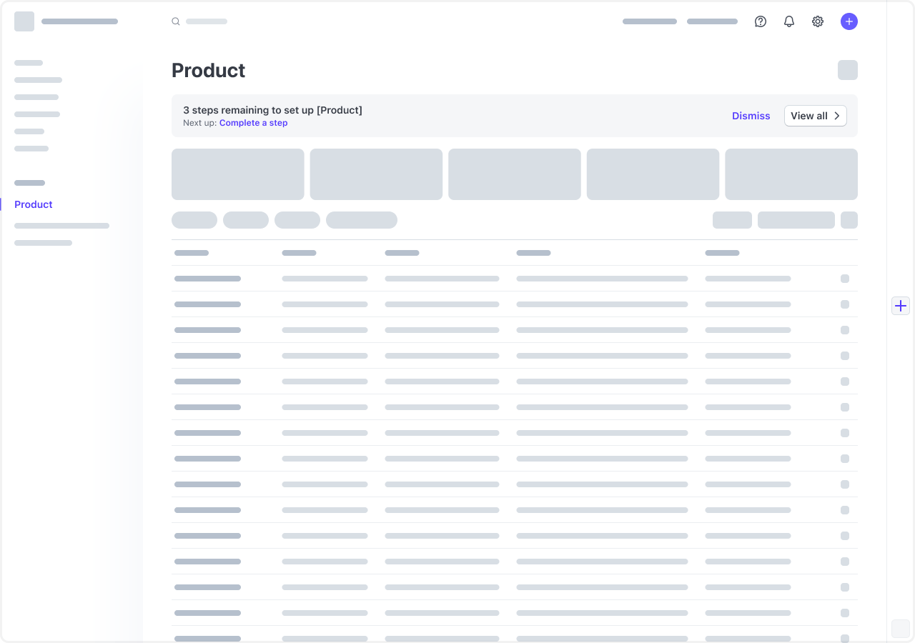
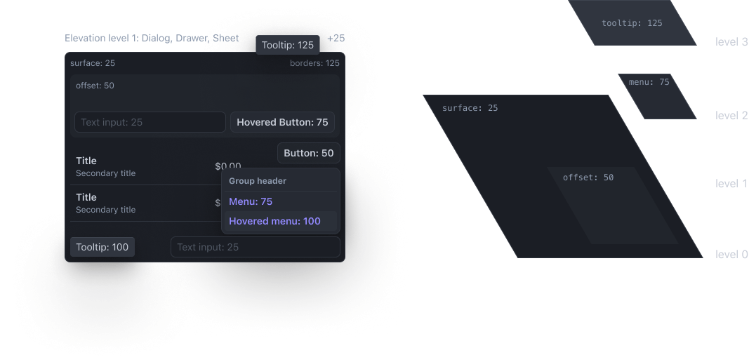
One of the most challenging aspects of the migration was making Stripe's dashboard responsive. Complex design patterns like tables, filter controls, and modal dialogs had to be adapted to small screens in a way that preserved information architecture and common pattern recognition.
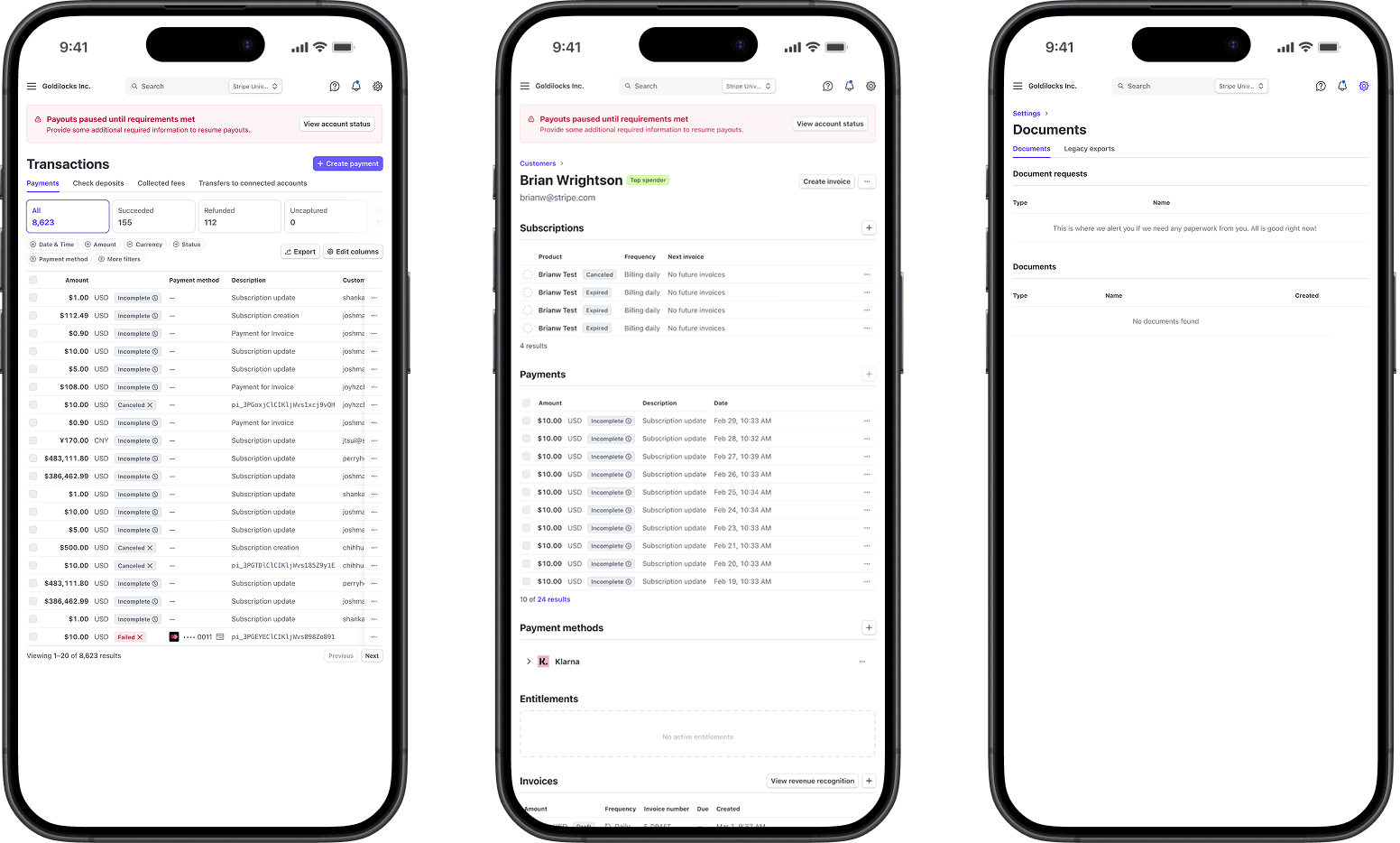
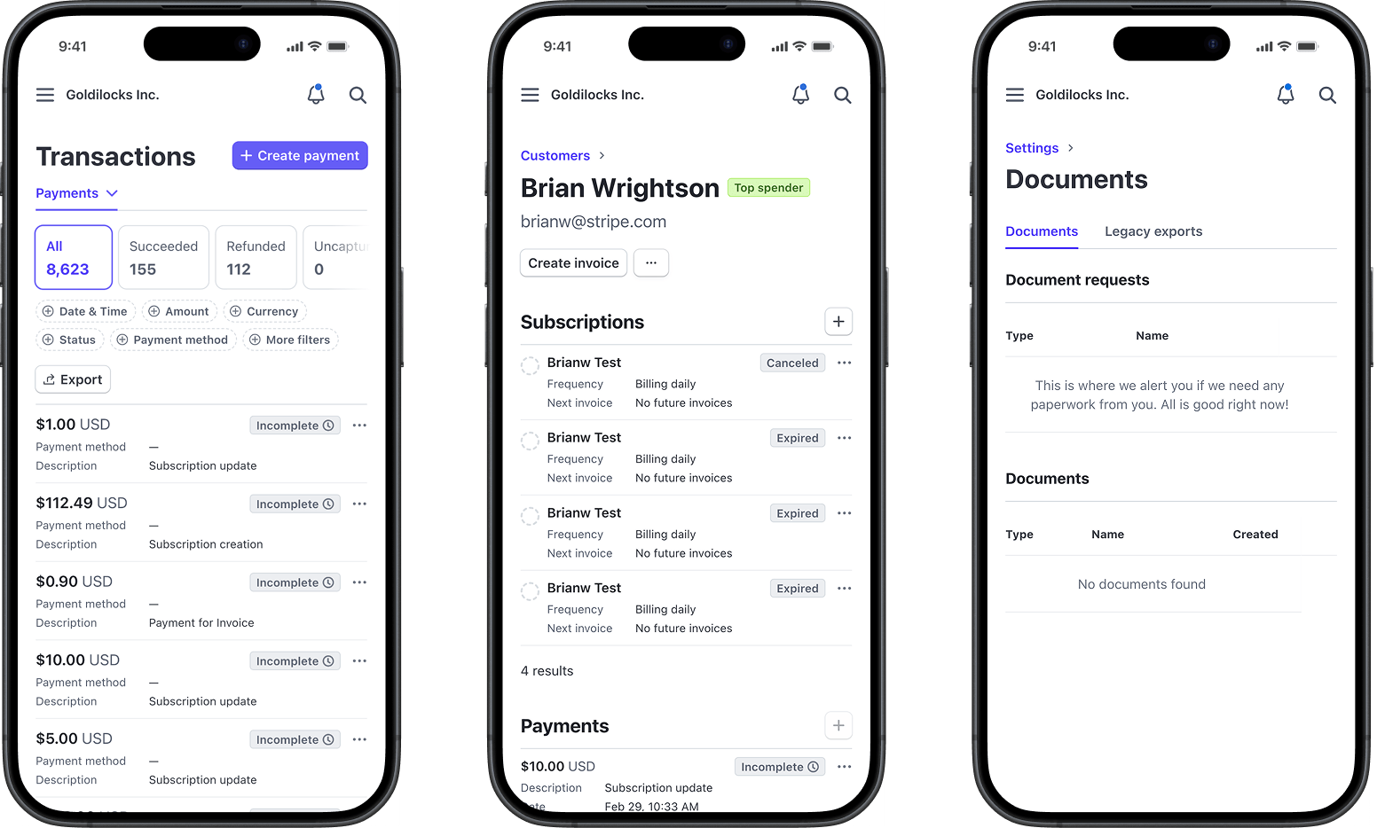
The goal wasn't just to provide a great experience for users on phones; we improved the overall design language of the dashboard to adapt to any screen size, meeting our users where they were most comfortable.
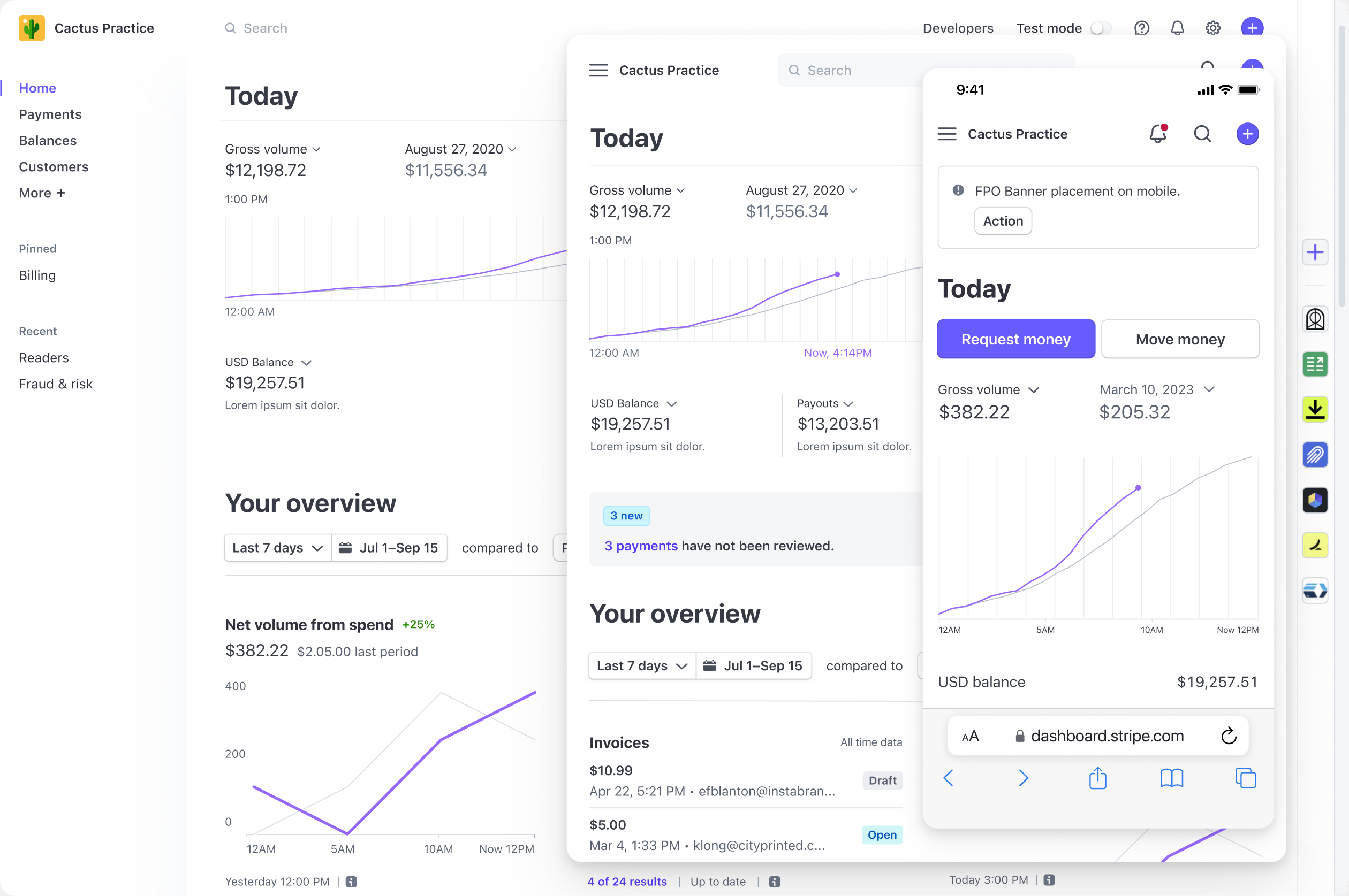
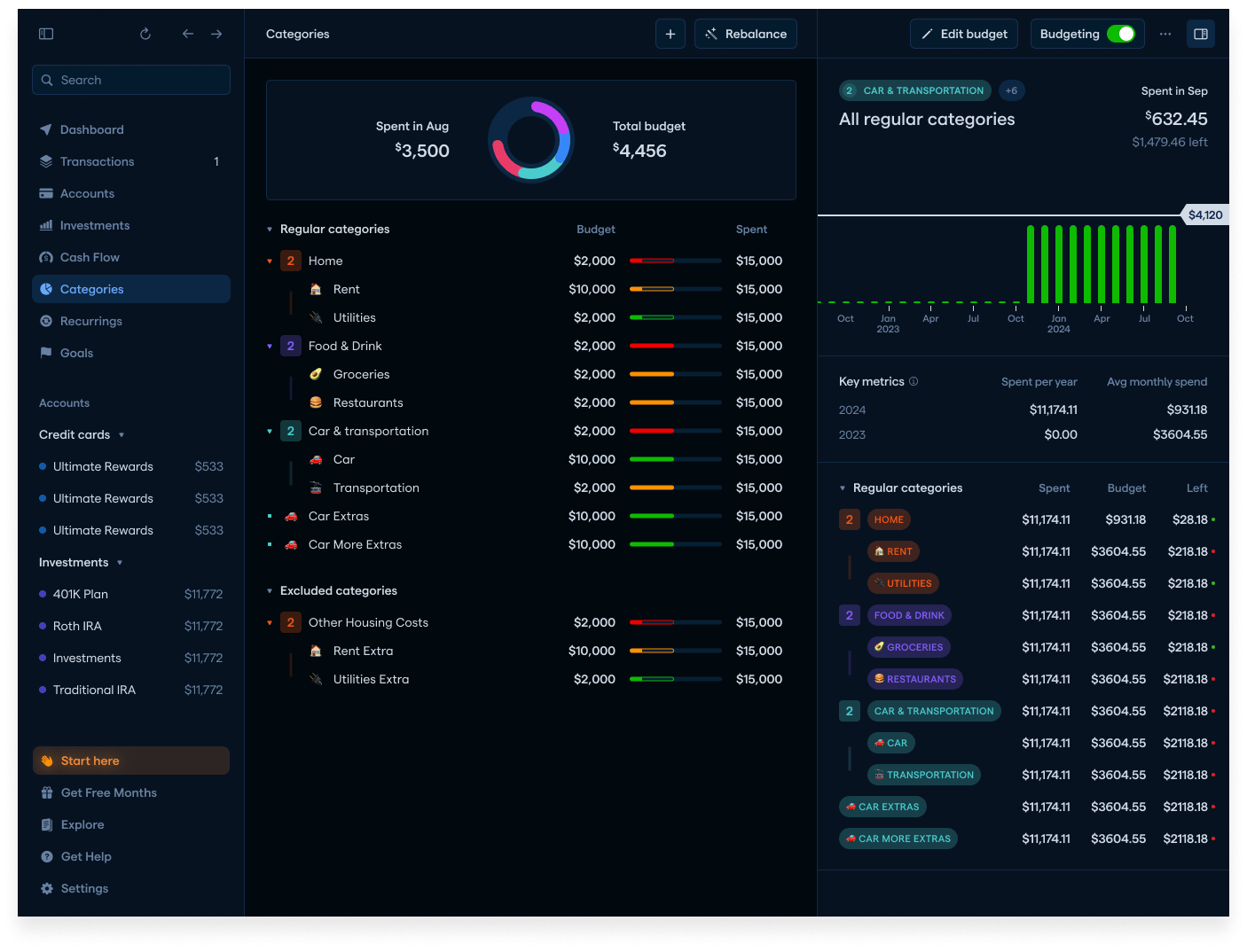
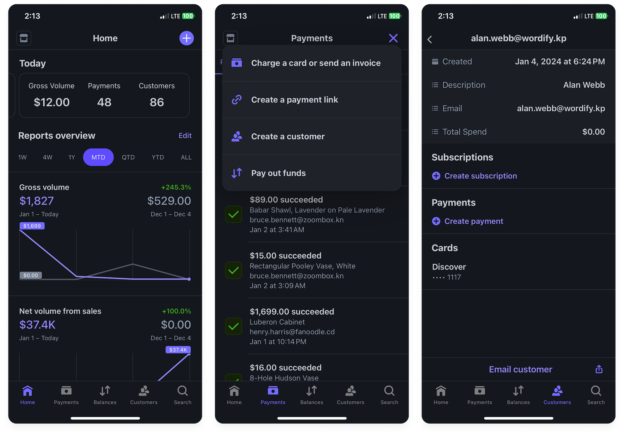
Theming
Because Stripe's dashboard was originally designed before the popularization of "dark mode," it was highly optimized for its default light mode theme. But as dark mode became more popular — especially among developers, one of Stripe's most important user segments — the dashboard's lack of theming became more and more glaring.
With Stripe's reputation for quality to uphold, my team focused on the details of a truly excellent dark mode: one that would not only look aesthetically pleasing, but also be accessible and intuitive in all contexts.
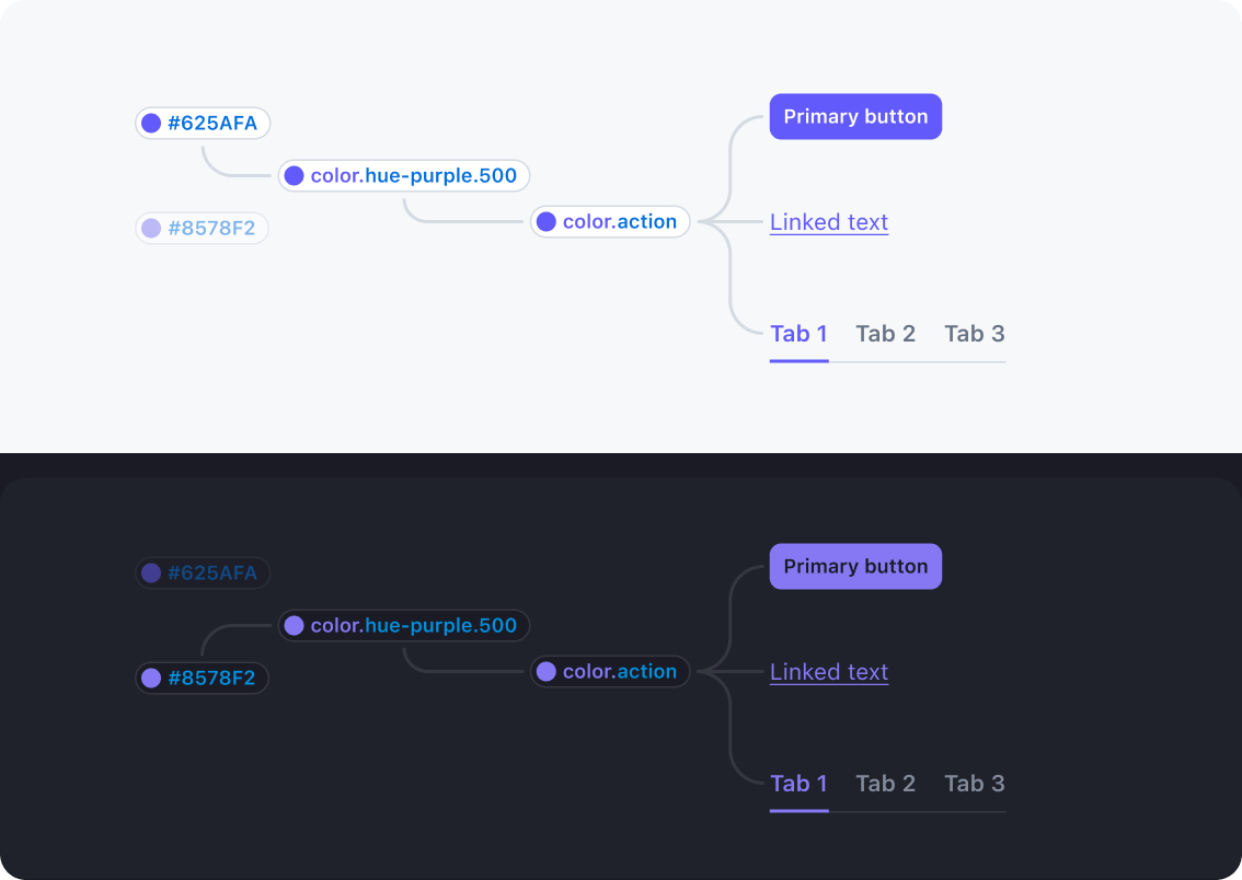
Dark mode was just the beginning. Because we architected all our components to use design tokens and an extensible theming architecture, we could introduce additional themes, like a "darker mode" for developer applications that needed to overlay the dashboard.
While the larger dashboard migration project was underway, we worked with the Stripe Mobile team to launch dark mode in the iOS app as a proof of concept. The release was received with great fanfare from Stripe's users.

Accessibility
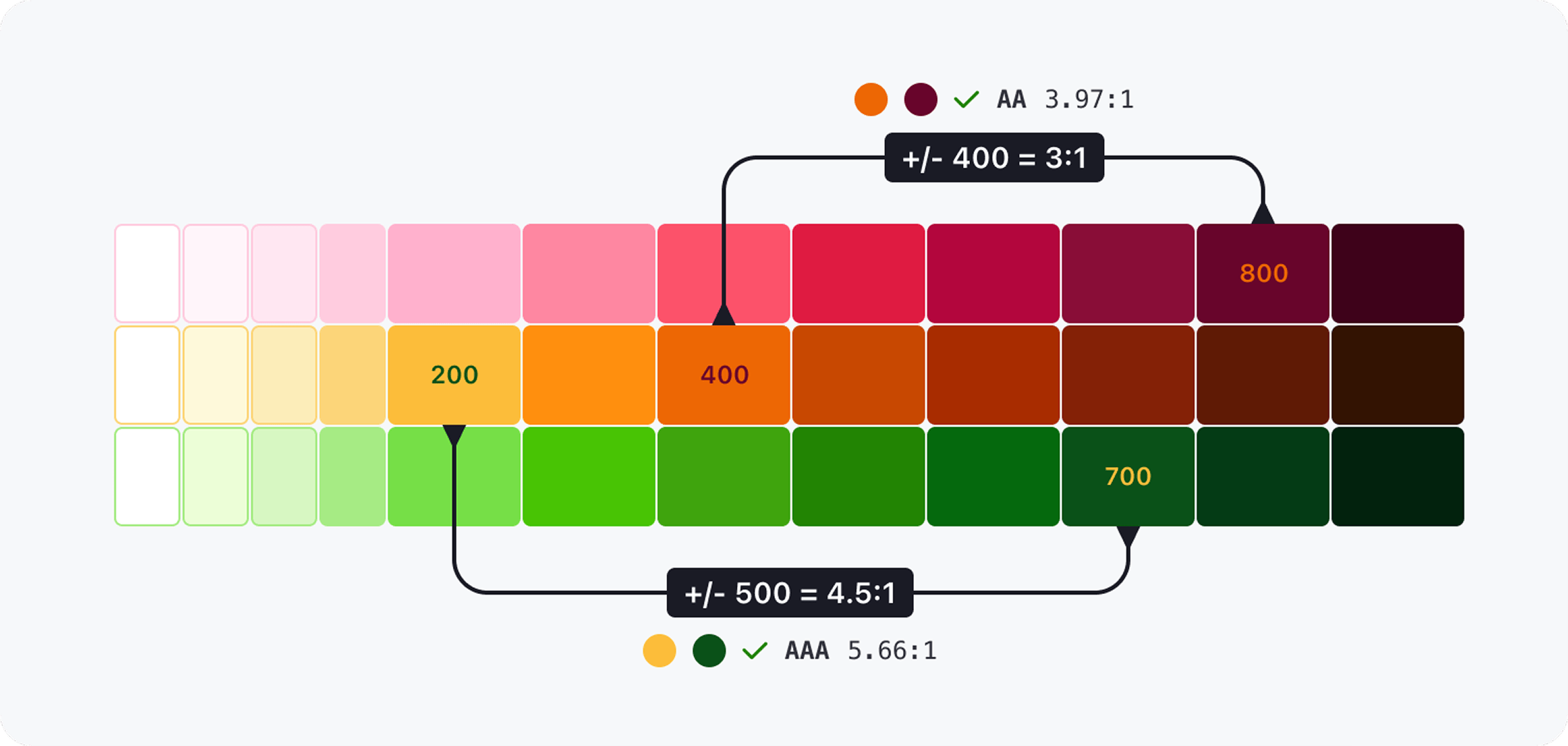
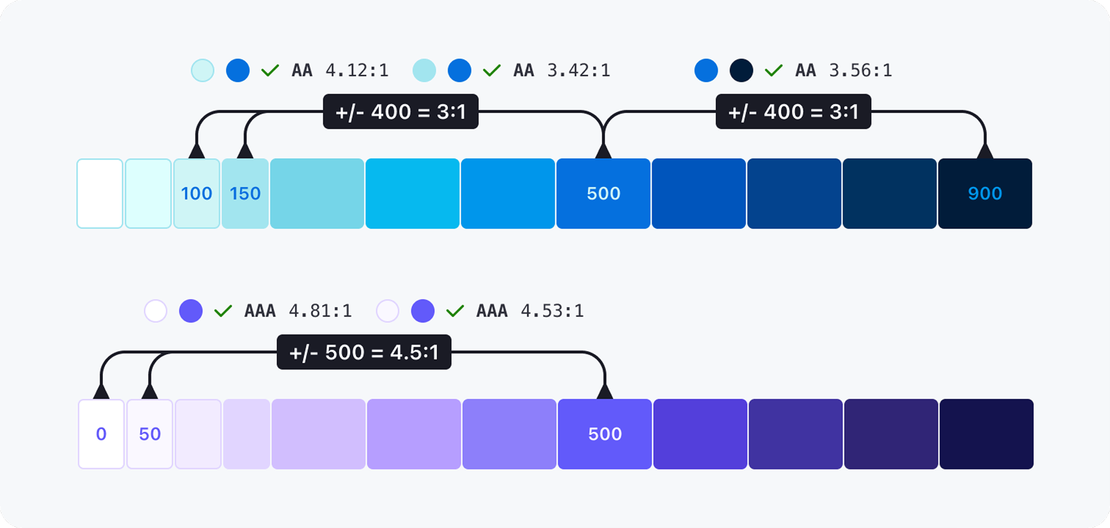
The updated theming architecture and page templates were designed to ensure accessibility, regardless of what input or color mode the user preferred. To enable accessibility at Stripe's scale, I developed a new approach to automatically generating color tokens based on the WCAG color contrast algorithm. I also worked with Stripe's policy team to develop and implement a global accessibility policy across the organization.
Conclusion
We didn't simply modernize the dashboard; by going above and beyond the status quo we created entirely new business lines for Stripe, and opened up new business partnerships; in 3 months after we implemented our accessibility policies, I helped close over $10 million worth of new SaaS partnerships with customers with stringent accessibility standards.
Visits from mobile devices grew sharply once we implemented the new responsive views, and experience quality (measured by support volume, task success, and session length) improved substantially.
Investing in the foundation of Stripe's merchant dashboard was a hard sell. Team structures and organizational priorities often emphasized vertical product lines over horizontal infrastructure work.. But, as a small team, we worked with focus and urgency over the course of years to set our partners — and the company — up for success.
Join the mailing list
I'll send new posts to your inbox, along with links to related content and a song recommendation or two.